2009 Top 10 (sort of)

Before I start into 2010 I wanted to do a quick review of 2010.

Statistics are wonderful things and one of the joys of the rich set of measures that are available these days is that you can quickly get some idea of what is going on. as with all statistics though they are there to help to build a story, they are not the story.

So here are some of my Top 10’s for 2009 since I’ve been on grahamchastney.com which has only been for part of the year. (I didn’t really see any value in combining two sets of statistics especially as I moved to grahamchastney.com in February).

Top 10 active posts:

1 Team Development: Forming – Storming – Norming – Performing
2 Rich Pictures
3 Slow Logon v Slow Applications
4 My New Fear of Working from Home
5 My Tools: Office Clip Art
6 Where’s the Whiteboard?
7 The IT Vendor – Pen League Table
8 New design for this site
9 Brabantia: Excellent Customer Care
10 Windows Live Writer Dictionary – Hack

The main thing to note here is that one of these posts has outstripped the others, and two posts have far outstripped any of the others.,

image

The main reason for this is that both of these posts appear high on the Google page order.

Top 10 search terms:

Search Term Views
forming storming norming performing 132
dilbert whiteboard 59
graham chastney 35
rich picture 20
runshaw bus fire 19
rich pictures examples 16
dilbert white board 15
galleny force 14
rich pictures 13
preston maritime festival 13

Like I say, statistics only tell part of the story.

CSC and Collaboration 2.0

You might be interested to see what CSC is up to internally with Enterprise 2.0 type technologies:

Well done Simon and Charlie.

We’re all lazy!

If someone is going to do something for us we are likely to let them, even if they don’t quite do as good a job of it as we would like. That’s the way we are wired.

There are, of course, exceptions to this situation, but in general we would rather be lazy.

Hyatt Regency San FranciscoIn IT our aim is to make things easier for people (I know it doesn’t always seem that way). The problem is, we often make it easier by taking away the responsibility from the consumer, making them lazy.

I was reminded of this again today by an article in Computerworld by Mathias Thurman. Mathias is talking about the creation of a policy within his organisation that enforces screen lock-out. Most people would regard this as good practice, and I’m not advocating that it’s not, my challenge and one that Mathias recognises is that the enforcement of this policy will make people lazy.

Some of the people within his organisation already have a setting that is more stringent than the policy that he is going to enforce. He says of these people:

They have shown the sort of awareness of security issues that I try to instill in the entire workforce, and now we’re rolling out a policy that seems to say that their security consciousness was unnecessary.

He’s right to be concerned, these people will start to see that the responsibility for security is no longer theirs and has shifted to be the responsibility of the policy set by the IT department.

There’s a greater challenge with this type of policy, and that is that all of the people will now rely upon the policy to lock their screens, including all of the people who used to manually lock their screens when they left their desks. For this group of people the security risk has actually increased, instead of the device being locked when not attended it will be left unlocked for a period of time until the policy kicks in.

This shift of responsibility means that people treat IT as something that is delivered to them, rather than something that they are responsible for.

Lack of responsibility has many facets to it that influence the behaviour of those consuming the services. These include:

  • Abuse of the services – “why should I look after this stuff it’s not my responsibility”
  • Working around the services – “if they won’t let me do it, I’ll just go and  do it somewhere else”
  • Apathy to the service – “I’ll just have to use this service because that’s all I’ve got available to me”

We need to find a new way of working that protects the business, but doesn’t remove the responsibility from those consuming the services. We need to do this recognise people’s innate laziness.

The IT Vendor – Pen League Table

I’ve been travelling a lot over the last few weeks visiting many IT vendors. One of the things that most of these vendors decided that we needed was a pen. Leaving aside the irony that IT vendors want to give us pens it was interesting to notice the difference in the pens that we were supplied with.

Do the pens say something about the companies? I’ll let you decide on that point.

Starting from the top of the picture:
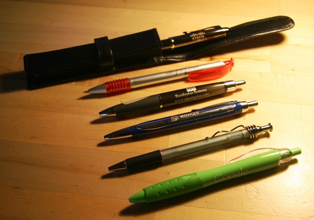
IT Pens League

Cisco

The only pen to come in a pouch. A very professional pen meant for serious people. An enterprise pen.

This is a heavy pen (but not the heaviest) which is going to be solid and reliable. It’s also the only pen with a lid meaning that is sits very nicely in the hand and is quite well balanced.

As for colour – it’s nearly black, so it’s conservative even in it’s colouring.

Writing Stars: ⭐ ⭐ ⭐ ⭐ ⭐

Salesforce.com

In complete contrast to the Cisco pen, the Salesforce.com pen is an incredibly cheap pen.

The pen I was given is actually broken. The reason it is the only pen pictured with the nib showing is that it won’t go back in and it has a crack down one side.

This pen did come in a kind of a sleeve, but it was really just a plastic wrapper. The side of the pen shows the logo, which is, of course, the name and the web site address.

Colouring – it’s silver and red which I take to be bold but not really funky or cool. It’s corporate, but not really corporate.

Writing Stars: ⭐

Eucalyptus

This is the only pen in the set to have a logo, a company name and a web site address. Perhaps this says more about Eucalyptus as a young organisation than anything else.

It’s a nicely weighted pen, on the light side, but with a good grip.

The pen itself is a Smokey black, but it writes blue. It might just be me, but there is something wrong about a pen that is coloured black, but writes blue.

It writes well and starts from the off, not requiring any warming up.

Writing Stars: ⭐ ⭐ ⭐

VMware

This is easily the heaviest pen in the set. I wouldn’t want to write with it for long, my fingers would drop off. It’s a proper metal pen and you definitely know if you drop it on the desk, actually the whole office knows if you drop it on the desk.

This time it’s a blue colour pen – that writes black (What are you guys trying to do to me?) Having said that, the blue does appear to be the standard VMware blue that they use in all of their material so works as a branding tool.

It writes well enough, but for such a heavy pen there is no grip to step it sliding around your fingers.

This pen also rattles a bit, I really dislike pens that rattle as I write.

Writing Stars: ⭐ ⭐

Appirio

Not sure quite what to say about this pen. There’s no logo on it, or any writing. It came with a notebook with the company name on it. I’m not sure whether putting the name, or logo, or web site address on the pen was too expensive for this relatively new organisation, but it’s certainly an opportunity missed.

I have hundreds of this type of pen and quite like them. The only think I don’t like about them is that I have a habit of twisting the clips off the top of them and it’s almost impossible to twist it back on.

It’s silvery see-through with a black grip. Not much to say really.

Writing Stars: ⭐ ⭐ ⭐

Google

I did have a couple of the Google pens in different colours. One of the things about having children is that pens quickly get appropriated to other purposes. On the colour front, as you’d expect, the pens were all in the colours from the Google logo.

No need to put a web site address on this pen.

It’s a perfectly adequate, functional, plastic, writing implement. The grip is good and it’s a good size for my hands.

A green pen that writes blue, but somehow I can cope with that more than a black pen that writes blue or vice versa.

The kids regarded this as the cool new pen to take into school.

Writing Stars: ⭐ ⭐ ⭐

Microsoft

We did go and see Microsoft, but they didn’t give us a pen – they gave us a drinks bottle.

Concept of the Day: Cultural Plasticity

I’m not sure whether this counts as a real fully fledged concept, or just an idea, or actually even whether there is a difference.

PisaThe idea comes from Jonah Lehrer over on The Frontal Cortext blog where he reflects on the diversity of music that we enjoy (his pretext is the events at the MTV awards with Kanye West and Taylor Swift).

It got me thinking, in what other ways are we culturally plastic:

  • Food: The range of food available in the UK is incredible. Foods from every country in the world and even fusions of different food types. We skip between them without really thinking about it, something that my grandparents would never have done.
  • Video/Television/Films: I know a few people who will only go to the movies to see a certain type of film, but there aren’t many of them. And the range of film genre is increasing all of the time.
  • Reading: Looking at the book shelf beside me there is a huge variety of material. There’s no Mills and Boon, but apart from that there is practically every other type of writing.

So what impact does this plasticity have on the world of work?

Teams that accept diversity work better and produce stronger results. As people become more tolerant of, and learn to enjoy cultural differences hopefully this will be reflected in teams. This will be especially true for international teams which will become more prevalent as technology enables it.

I suspect, to, that people we start to choose the places where they work on the basis of the diversity of the culture. Places with a monolithic culture we be regarded  as stale and dull. Skilful business managers will be able to create diverse cultures that are highly productive.

That’s amazing – Creating a photograph book

Tuscany 2009The other day I was listening to a radio programme about book binding (no, I’m not sure why I was listening, if that’s what you are thinking). This programme talked about the elaborate process that the ancient book-binders used to go through to create what would become a work of art. One particular book that was mentioned took 2 years to bind – not to create, to bind.

On returning from holidays we wanted an physical album of photographs to show people; it’s still a much better way of interacting with the images in many situations.

What did I do?

  • Downloaded the photographs from my camera.
  • Sorted through them for the ones I wanted to put in the album.
  • Downloaded some code from a web site where I was going to get the photos printed.
  • Started the code and imported the photos.
  • Looked a the book that it created automatically and made a few changes.
  • Sent the book for printing.
  • 3 days later (because of the weekend) my photo album had arrived.

The album looks wonderfully professional and cost me less than the price of a new shirt and only about twice the price of a paperback at the local book store.

I’m not suggesting that my photograph album compares with ancient book binding – but the change in the process of creating a book is incredible. What’s more I undertook this transaction using commodity technology and a service from a budget supermarket. It’s not specialised, it’s not “out there”, it’s normal life.

Sometimes it’s good to remember how far we have come.

Expressions – inside, outside, sideways

I spend a good deal of my life expressing my thoughts and feelings on all sorts of online communities. Glen Coe

Some of those communities are inside the organisation that I work for, a good deal of this expression, like this blog, is done outside the organisation.

I wrote the other day about all of the ways in which I could waste my time, I did this as a bit of a joke. Truth is that all of the places of expression take time, but there are lots of other challenges to working this way. Here’s my top 10:

  1. Am I repeating myself? – it’s difficult to know what I have said where, sometimes I have to check, sometimes I’ve got it wrong.
  2. Am I saying the right thing? – there are different audiences so I need to make sure that what I say is relevant and doesn’t reference something I said somewhere else.
  3. Am I breaking confidence? – I can say things inside the organisation that I can’t say outside.
  4. Am I giving people the attention that they deserved? – I’m not writing very often on this blog because I’m spending so much time writing inside the organisation. Am I being disrespectful to my external audience, and does it matter?
  5. Are my comments relevant? – Comments are a particular challenge. If I comment inside the organisation I shouldn’t expect people to know about me outside the organisation and the same is true the other way around.
  6. Where do I aggregate information? – If I send my Twitter updates to Facebook are they relevant in Facebook?
  7. Some people will see more than others – some read only one thing that I write, others read a lot of things.
  8. Does the real me come across in a single stream? – If someone only read my Facebook what impression would it give? If they only read my blog would the impression be different?
  9. Should I consolidate? – It’s always better to do one thing well. Would I be better dropping Twitter, Blog, etc.
  10. How do I prioritise? – Is inside more valuable than outside? Is the number of readers significant?

In summary; I sometime feel like I’m in the middle of a social experiment; an experiment that will radically change the way we work over coming years.

Sorting out that pesky iPhone

There are times when I so wish that this could be true:

The bit after the credits is definitely the best bit – “That’s not what iPhone was made for – I’m loaded with technology”.

(Hat tip to One Man’s Blog)

“Two million lured to spoof tan site”

Sometimes I read a story and wonder whether there is really any hope for us.The Road to Inveraray

A spoof website offering computer users a tan through their screens has received nearly two million visits in just a few months.

Computertan.com was launched by charity Skcin in a bid to raise awareness of the danger of ultraviolet rays.

Its new infomercial, designed by advertising agency McCann Erikson, promises viewers a tan from the safety of their desk and offers a free trial of the "tantastic experience".

The slick production even runs a fake calibration tool to set up the gadget. But images of UV bars on the screen soon fade to reveal the message: "Don’t be fooled. UV exposure can kill".

Viewers are then met with graphic pictures of damage done by ultraviolet rays.

From MSN

That’s right 2 MILLION people believed that their computer screen could give them a tan, and what’s more, they thought that it was a good idea?

The whole thing is wrong on so many levels that I don’t quite know where to begin – so I’m not going to bother even trying.

Buzzword Density: 2.0

I started today with a bit of a smile.

I’m currently working on a desktop related piece of work, something that deals with real people’s real issues. I work in an organisation, though, that does rather enjoy it’s buzzwords:

SPAM – how much CO2?

I have always been intrigued with the Carbon footprint of the IT culture that we are building. I have found that people make the assumption that things that are free, are also free in environmental terms too. This is clearly illogical, but people somehow miss that connection.Blackpool Prom Scuptures at Sunset

McAfee have recently undertaken a study that highlights the massive overhead, in CO2 terms, of SPAM:

The average business email user is responsible for
131 kg of CO2 per year in email-related emissions,
and 22 percent of that figure is spam-related. This
spam energy is equivalent to the emissions that
would result if every business email user burned
an extra 3.3 gallons of gasoline annually.

The energy required annually to create, send,
receive, store and view spam adds up to more
than 33 billion kWh, approximately equivalent to
four gigawatts of baseload power generation or
the power provided by four large new coal power
plants. ICF estimates spam-related emissions for all
email users at an annual total of 17 million metric
tons of CO2 or 0.2 percent of the total global CO2
emissions — a number equivalent to emissions
from approximately 1.5 million U.S. homes.

The scary part of this report is the thought that 52% of all of this energy usage is consumed by end users viewing and deleting SPAM.

I’m sure that most people regard SPAM as a nuisance, but I don’t think that many people regard it as a ecological pest also.