Following on from my popular post – Your updates aren’t that important – I really liked this cartoon:

From Bonkers World
From a personal perspective I don’t regard anything posted on Twitter as being there for the long-term.

Following on from my popular post – Your updates aren’t that important – I really liked this cartoon:
From Bonkers World
From a personal perspective I don’t regard anything posted on Twitter as being there for the long-term.
Lots of people posted about this last week. I was on holiday so didn’t, but thought I would for anyone who hasn’t seen this.
 The video shows a Microsoft perspective on the 5-10 year future of how "people get things done at work, at home and on the go".
It’s an update to a concept video that I posted about back in 2009, so is as interesting as a comparison as it is for it’s current content.
The interesting part for me is the view of how many people will still be working within an office at a desk, and how many people will still be travelling the globe to get work done.
I was also interested by the limited use of gestures, but judge for yourself:

";” alt=””>
There’s more detail on the concepts being shown on the Microsoft Future Vision site.
I really like pictures.
The most visited page on this site is one about Rich Pictures.
I regularly pick out interesting Infographics.
One of my favourite books at home is called Information is Beautiful which is named after the popular website.
 Why? Because “a picture is worth a thousand words”, or at least that’s the axiom I tell myself.
I wonder, though, whether this is really true.
If it were really true we’d spend much more time drawing, and far less time writing words. Yet writing words is what we do and do a lot (much like I’m doing now).
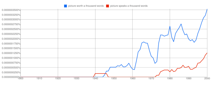
Many think that the saying is ancient and oriental, but the evidence for that is somewhat sketchy at least the literal translation. What can be said is that it was used in the 1920’s, became popular in the 1940’s and continues to be a preferred phrase. The variation on this “A picture speaks a thousand words” didn’t come until the 1970’s:
Just because something is popular, and just because it appears to be true doesn’t mean that it is true.
In order to assess the validity of the axiom I set off down the scientific route. What research was there for the value if diagrams?
If it were to be true then there would be some clear evidence for a picture being a much better way of communicating than a set of either spoken or written words.
I was always taught that there were three types of learners: visual learners, auditory (listening) learners and kinaesthetic (doing) learners. So I wondered whether there might be some mileage in the research done into that particular subject. If visual learners are stronger than auditory learners then it would add weight to the premise. But it turns out that learning styles might be one of my anti-axioms. So I gave that up as a dead-end.
My next port of call was to think of one particular diagram type and see whether there was any science behind the value of a particular technique.
Most of the pictures I draw are really diagrams with the purpose of communicating something.
As a fan of mind maps as a diagramming technique I wondered whether there was any clear evidence of their value. Back in 2006 Philip Beadle wrote an article in The Guardian on this subject and the use of mind maps in education:
The popular science bit goes like this. Your brain has two hemispheres, left and right. The left is the organised swot who likes bright light, keeps his bedroom tidy and can tolerate sums. Your right hemisphere is your brain on drugs: the long-haired, creative type you don’t bring home to mother.
According to Buzan, orthodox forms of note-taking don’t stick in the head because they employ only the left brain, the swotty side, leaving our right brain, like many creative types, kicking its heels on the sofa, watching trash TV and waiting for a job offer that never comes. Ordinary note-taking, apparently, puts us into a “semi-hypnotic trance state”. Because it doesn’t fully reflect our patterns of thinking, it doesn’t aid recall efficiently. Buzan argues that using images taps into the brain’s key tool for storing memory, and that the process of creating a mind map uses both hemispheres.
The trouble is that lateralisation of brain function is scientific fallacy, and a lot of Buzan’s thoughts seem to rely on the old “we only use 10% of the neurons in our brain at one time” nonsense. He is selling to the bit of us that imagines we are potentially super-powered, probably psychic, hyper-intellectuals. There is a reason we only use 10% of our neurons at one time. If we used them all simultaneously we would not, in fact, be any cleverer. We would be dead, following a massive seizure.
He goes further:
As visual tools, mind maps have brilliant applications for display work. They appear to be more cognitive than colouring in a poster. And I think it is beyond doubt that using images helps recall. If this is the technique used by the memory men who can remember 20,000 different digits in sequence while drunk to the gills, then it’s got to be of use to the year 8 bottom set.
The problem is that visual ignoramuses, such as this writer, can’t think of that many pictures and end up drawing question marks where a frog should be.
Oh dear, another cul-de-sac. In researching the mind-map though I did get to a small titbit of evidence, unfortunately from wikipedia (not always the most reliable source:
Farrand, Hussain, and Hennessy (2002) found that spider diagrams (similar to concept maps) had a limited but significant impact on memory recall in undergraduate students (a 10% increase over baseline for a 600-word text only) as compared to preferred study methods (a 6% increase over baseline).
That’ll do for me for now, it’s not “a thousand words” but it’s good enough for my purposes.
Why am I comfortable with just a small amount of evidence? Because this is one of those axioms where it’s not only about scientific proof.
Thinking about pictures in their broadest sense there are certainly pictures that would take more than a thousand words to describe them.
There are pictures that communicate emotions in a way that words would struggle to portray.
There are diagrams which portray a simple truth in a way that words would muddle and dilute.
In these situations the picture is clearly worth a lot of words, but our words would all be different. The way I would describe an emotional picture would be different to the words you would use. So it’s not about the number of words, but the number of different words.
This little bit of research has got me thinking though.
How often do we draw a diagram thinking that everyone understands it, but we’re really excluding the “visual ignoramuses” (as Philip Beadle describes himself). or the “visually illiterate” (as others describe it)?
In order to communicate we need to embrace both visual literacy and linguistic literacy in a way that is accessible to the audience. I used to have a rule in documentation, “every diagram needs a description”. The PowerPoint age has taken us away from that a bit and perhaps it’s time to re-establish it so that we can embrace the visual and the literal.
I’m happy to keep this as an axiom, but I need to be a bit more careful about where I apply it.
I have a rule, I’ll stop talking the moment someone looks at their device.
 As soon as I’m aware I’ve lost their attention I stop. If someone starts tapping on their screen or keyboard I’m likely to leave the room.
Let’s face it, most of what people say on social media isn’t so important that it can’t wait for a few minutes, so why do people feel such a sense of urgency about it?
The simple answer is that they’re not really thinking about what they are doing. They’re just carrying out a learnt response to a stimulus. The stimulus is the beep or vibration, the response is almost automatic.
The real problem comes when the learnt response isn’t just rude it’s dangerous. I’ve watched pedestrians take out their phone half way across a road. I’ve witnessed people drawn in while driving and cycling. I’ve dropped items I was carrying to respond to the calling. Clearly I’m not the only one thinking about it as an issue:


Has anyone noticed that I’ve written less recently?
Has anyone noticed that I’ve written more recently?
 Depending upon what you read you may have noticed different things.
I took a look at the amount of time I spent writing interrupt driven content on Twitter and Facebook and decided that it wasn’t the best use of my time.
I found that I was spending a significant amount of time checking for updates so I could respond to updates. All I was doing was feeding my ADT.
I decided that it was time for a bit of housekeeping. My aim was to replace quantity with quality. Rather than writing hundreds of 140 character interactions, I want to write more considered, longer interactions of a higher quality.
So I’ve taken a few simple steps:
The result is that I’ve written a lot more on my blog and managed to calm down my ADT quite a bit. A bit like a reformed smoker, I’ve started to notice how bad some people are. I’ve read a lot more. As well as being more productive on my blog I’ve been more productive in a number of other areas too. I’ve also been sleeping better and increased the amount of exercise I do.
Not surprisingly, the number of visitors on my blog has grown significantly too, but that’s not why I’m doing it.
Someone (I can’t remember who) pointed out this Google Chrome Domino cascade the other day:

";” alt=””>
It reminded me of how much fun we used to have with dominos when we were kids, but we never quite got to do anything as fun as this one from a supermarket somewhere in Finland:

";” alt=””>
I wonder if they sold all of the boxes of (broken) breakfast cereals and biscuits afterwards.
I have had this happen to me so many times that I’ve almost stopped noticing it happen:

It’s a sign of our times, and not a good one.
My normal response to it happening is to sit there and wait for the person to come back to me. I feel a bit like a teacher standing waiting for a class to be quiet.
"If you want to control privacy and attention – just put them in a group" seems to be the answer that most of the socials media (and other) sites are moving towards.
 Each of them has a subtly, or even dramatically, different way of implementing groups, but fundamentally they are all trying to do the same thing.
The basic philosophy is that we can put people into different buckets and the bucket is then linked to different levels of privacy and attention.
The main reason for the buckets is that they provide a way of simplifying the administration of the system.
In most instances the group configuration that most people use is quite simple. Flickr, for instance, doesn’t even let you create your own groups, it gives you three – contacts, contacts that are friends, contacts that are family – that’s it. People need to fit into one of these buckets if you are going to control what pictures people can see. Google+ has circles which are nicely animated, but basically do the same thing. You can have as many Circles as you like, and you can put people into those circles in order to control what people see and what you see about people. Twitter’s notion of a group is the list, but they only help attention management, they don’t do anything for privacy.
There are a number of challenges with this situation.
The first challenge is the most obvious issue – there is no way to manage groups across the various services. If I want a family bucket on Flickr and Facebook I need to create it, and administer a group on Facebook and another group on Flickr. If you really wanted to get organised about the groups that you use you would spend a significant amount of time administering all of them.
Another challenge, and the most fundamental one, is that socially a group is quite a fluid thing, and the fluid has different densities. My example here is an event with a group of friends. The group for the event starts off as the group of friends who are invited. The group related to the event doesn’t stay like that though, as people choose whether they are coming, or not, the group changes, but it doesn’t change in the same way for everyone. Some people who are not attending may still want to be told about the group as the event occurs, others don’t want to know anything. If we are running the event for the group of friends we will know the difference between the people to keep in the loop, and the people to leave out. The members of the group have changed, but so has the type of connection that people have with the group.
Groups might help us in administration terms, but I don’t think that groups really give us what we need.
Also see: Privacy and Attention Dimensions
I’ve found it quite interesting recently to watch as a number of social media sites, Facebook, Flickr, G+, have introduced changes in the ways that privacy is controlled and attention is raised.
 Most of us have an instinctive approach to both privacy and attention. We tell certain things to certain people, and not to others. I doubt many of us could, in most instances, describe this instinctive privacy by a set of "if…then…" statements. Most of us have a similarly instinctive approach to attention, we know which messages require us to raise someone’s attention directly, and which are just noise.
There are, however, a set of people for whom this instinctive approach doesn’t work. All of us suffer times when we get the privacy and attention approach wrong. I’m sure I’m not the only one to have passed on a piece of information I thought was public to find that it’s pure gossip. But there are also a set of people who’s privacy and attention framework doesn’t work the same as the rest of society, for some people this manifests itself as autism.
Today’s online communication mechanisms are a bit like dealing with an autistic child. So many things that are shouted in public should really be said in private. There are certainly things that aren’t said as loudly as they should be too. One of the major complaints of any online system is the amount of noise they generate trying to get our attention – "no I don’t care that you’ve just bought a sheep".
We try to apply a set of physical world metaphors to our online privacy but the current approaches still require us to think about who we want to see what when we post it. I think we still have a long way to go before online systems get closer to being aligned to our privacy and attention instincts..
There are a whole set of dimensions to privacy and attention that I don’t think we yet really understand, and we certainly haven’t done enough to codify them yet.
It was with that in mind that I read about the new capability on Flickr to create geofences. Geofences enable you to define a privacy level for pictures taken in a certain location. This is a new dimension to the privacy debate as far as I can tell. I have, as an example, set pictures that are taken near my home to be private to Friends and Family only (no that’s not the location of my home):

It might be a new dimension, and add to the toolset available, but it’s still not really how I think my privacy instincts work.
Facebook has always had an attention problem which most people don’t realise you can adjust already by turning off certain notifications. There latest approach to tackling this problem is the new lists feature. I say new, but it feels very much like the way that Google+ works, although I’m sure they’d argue differently. Again, it’s another dimension to breaking down the attention problem, but I still don’t think that my personal attention instincts work that way.
One privacy dimension where I think we are nowhere near codifying our real world experience is in the area of memory. I think that we are only just reaching the point where we are realising what a good thing our ability to forget is. I’m sure I’m not the only one who would like the internet to forget certain things about me.
Some illusionary fun with a bunch of iPhones from Marco Tempest; that’s about as much as you need to know:

";” alt=””>
I love this cartoon from Bonkers World about different organisation structures:

I work in a large organisation that looks much more like a couple of these charts than others, and there are days when I’m not sure what it really looks like.
When people unfamiliar with the organisation ask how they get things done I regularly tell them that the informal organisation structure is much stronger than the formal one. So perhaps the diagram doesn’t matter too much anyway.
The connected world we now live in makes a whole set of new organisational shapes possible and great many of them will be successful.
At the end of the day it’s the people that matter though.
Hat tip to Seth Godin.
In London’s famous Trafalgar Square there are a set of plinths with sculptures on them, there is also another plinth – known as the fourth plinth – which doesn’t have anything permanent on it.
 This fourth plinth has, in recent years, been used to host all sorts of art projects and installations.
The installation that gained, probably, the most public interest was Anthony Gormley’s One & Other.
In this project people were invited to apply for a sixty minute slot on the fourth plinth. The intention was to “create a collective portrait of humanity”, this translated into people doing all sorts of things for their sixty minutes of fame. Many people chose to carry plaques with a message on them others performed an activity, all of them were videoed.
The people who gained the most fame were, not surprisingly, the people who chose to spend some, or all, of their time naked.
I sometimes ask myself the question when I’m posting something to Twitter or Facebook or even this blog:
If I were stood naked on the fourth plinth and the whole of London were watching would I still be comfortable saying this?
There are a lot of people who could do with a similar checkpoint before they write and post.
(The reality of posting to Twitter or Facebook (or any other ‘social’ site) is actually a whole lot scarier than standing on the fourth plinth with a plaque but for some reason the scariness doesn’t translate into caution)
