I’m not a big fan of signs, particularly ones that state the blindingly obvious, so today post contains a selection of imaginatively modified ones:


There’s plenty more here, but be warned I picked the polite ones.

I’m not a big fan of signs, particularly ones that state the blindingly obvious, so today post contains a selection of imaginatively modified ones:
There’s plenty more here, but be warned I picked the polite ones.
Another TED talk that provokes and encourages:

";” alt=””>
I’ve spent a good deal of my time over the last few days ‘crafting slides’.
This particular activity hasn’t changed a great deal in the last 15 years.
All sorts of progress and development in the collaboration arena has taken place over that time.
So why no change?
Why do we still need to transact over a set of information in a meeting?
I work in a world that can appear very complicated. There are options all around, different ways of thinking about things at every turning, a new methodology just over the horizon and innovations just around the next corner.
Choices upon choices upon choices. Options within options within options.
I’ve been in a number of situations recently where, in response to this complexity, someone has said – “the devil is in the detail”. It’s a common saying which seems to get applied whenever complexity looks like a problem but is it really just cheap shorthand? Is it just an office cliché?
One recently situation was a review meeting where a number of people where looking at a design for a project we’ve been working on. Like all designs it defines a solution to a level. To document it all would be impossible and produce mountains of documentation, so the design focuses on the major elements and defines them to a level to enable understanding. During the review someone said something like “I’m OK with this document, but like all of these things – the devil is in the detail”. Whether it was deliberate or not the individual concerned was communicating “it doesn’t matter how good a job you do you’ll miss something that really important that will make our life difficult later on”.
In another situation someone was explaining to me the various options that existed for a solution to a customers business problem. I needed to be able to understand, at a high level, what the options were. The only way this particular individual could communicate was via the detail – lots of detail. When I tried to summarise what they were telling me their response was “yes, but the devil is in the detail”. or, in other words, “don’t simplify it, it’s too complex”.
These two situations got me thinking – is the devil really in the detail?
When I look back at all of the projects that I’ve conducted and all of the solutions I’ve delivered, how many times has the devil really been in the detail?
And, if we had spent more time on the detail would we have found the devil and removed it?
Or, actually, has the devil really been somewhere else?
Here’s my short conclusion: Sometimes, yes the devil has been in the detail, but normally, no the devil wasn’t down in the detail. And what’s more, where the devil was in the detail it is highly unlikely that would have found that devil by being “more detailed”. The devil wasn’t hiding in the detail we were looking at, he was busy in another bit of detail out of sight..
What I have noticed though, is that more often it’s not in the details that the devil lies – it’s in the overview, the macro, the summary. Or more specifically, it’s in the assumptions that accompany the high level view.
In simpler terms:
When I say x I mean x,
but you assume that when I say x I really mean x + y.
This is where a dichotomy raises it’s head. If the devil is in the summary and the overview, surely the answer is more detail – but actually putting more detail in just adds fuel to the fire of confusion. The detail doesn’t lead to understanding, it leads to blank stairs and nodding unknowing heads.
What can be the answer?
Unfortunately I have no hidden supply of magic bullets, or long lost alchemy, just some observations:
I love visual things, there are far to many situation where a picture would be much better than lots of words.
Here’s a collection of some of the visual sources that I love to use:
 Information is Beautiful
 Geek and Poke
  1.00 FTE
 Someone Once Told Me
 Patrick Smith Photography (flickr)
  Flickr Blog
 Richard Shilling Land Art
 The Cartoon Blog
 Brian Rafferty Wildlife Photography
There is . of course, always my own materials: Graham Chastney (flickr)
Communication remains a challenge to many, including myself.
I’ve found that the following tips really help though:
I love inforgraphiics.The people over at colourlovers.com have done an assessment of the most powerful colours in the world, including the colours of the most powerful web presences. It’s really interesting to see the influence of reds and blues but also the power of multi-coloured approaches that focus on the primary colours (below). If you are thinking of launching a social networking site though, you need to make sure that your icon uses blue.
It’s also interesting to see how different this is to the spread of colour for corporate America overall.

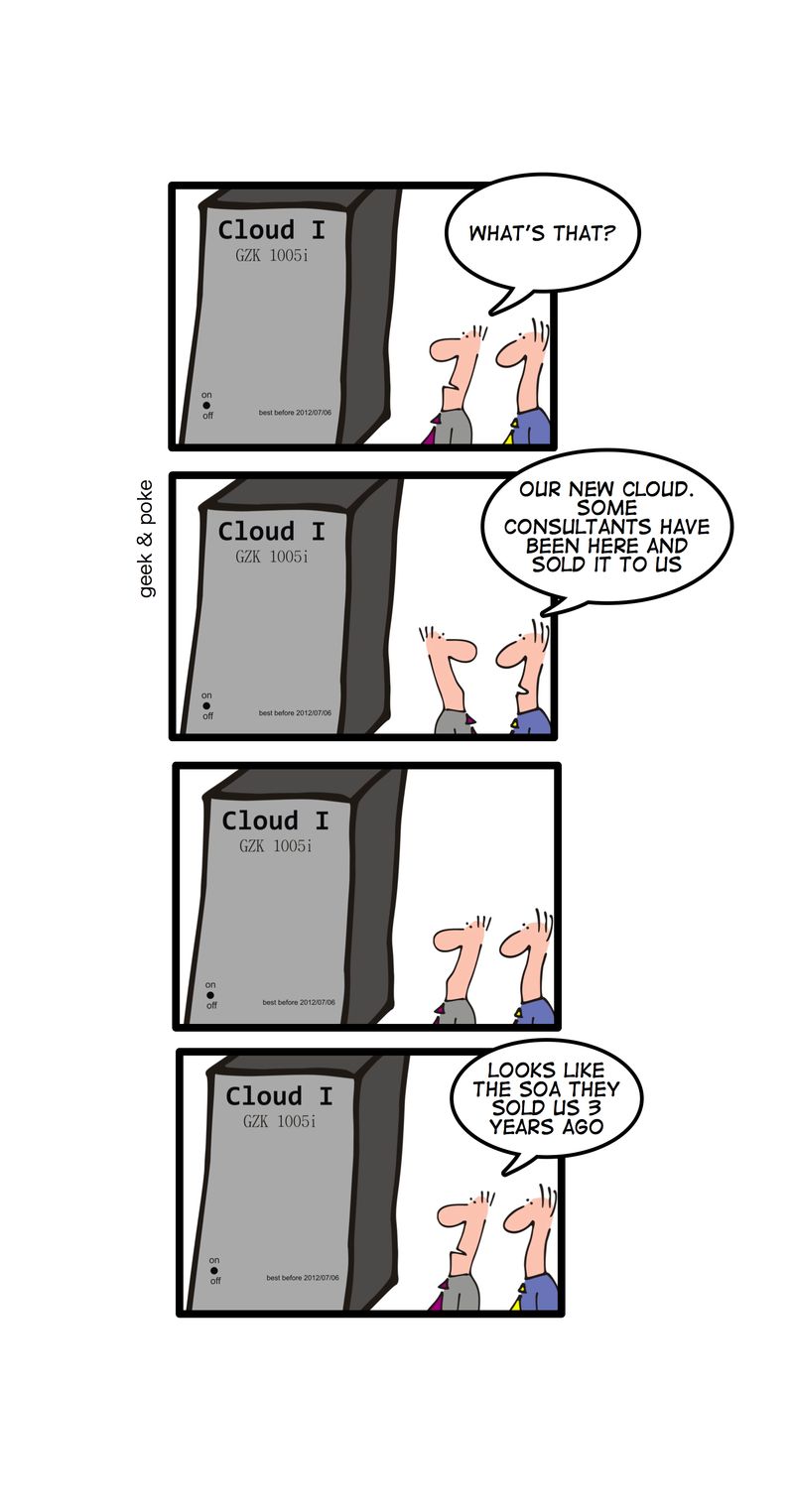
I’ve witnessed the entropy of many a fine concept in my time.
For those of you who have forgotten your schoolboy physics a quick reminder on what entropy is – and there are a lot of fine definitions, but I want to focus on a simple illustration. Entropy is what happen to your kettle after you have turned it off – it cools down until it is at room temperature. All of the heat dissipates until the temperature of the kettle is no different to everything else around it – well almost.
Within the IT arena we come up with all sorts of good ideas, but I’ve seen many of these ideas go through the same entropy cycle.
At this point the system is still being heated up – the concept is still cooking, but entropy is about to kick in.
SOA is the last years concept, Cloud is this years. SOA has just finished the cycle, Cloud is on it’s way through the products phase.
I said at the beginning that a kettle cools down until it is just like everything else around it – well almost – and it’s that well almost that is important. The extra heat that the concept has generated doesn’t die – it’s just been dissipated throughout the other systems. The products that get delivered to enable a concept still live on making a difference to the way that organisations work. The products aren’t delivering the concept, but the residue of the concept that lives in the products is making a difference to systems around them.
One of the most popular blogs on this site is the one on Rich Pictures. I think that pictures are fabulous, so I really liked Dan Roam’s article on ChangeThis called Found In Translation: The Case for Pictures in Business.
 In this article Dan tells a simple story about getting directions in Moscow and the four different ways in which he could have been given the directions.
and Dan describes each one of them:
All four of these sets of directions are correct. Following any one of them should in theory get us to the Gagarin Museum in the same amount of time. But here’s my question: I’d like you to look over the four options again, really think about it for a moment, and then ask yourself this: if we actually were in Moscow, which option would you prefer?
The powerful communication methods are the map and the landmark sketch – without a doubt. We all know it’s true, so why do we use so many words in business?
I believe that for practical, business-oriented problem solving—when you and your team need to address something right in front of you right now, the visual options—the map and the landmark sketch are without question the way to go. The fact that we so rarely see these kinds of pictures used in business is why I write my books.
Over the last two days I’ve filled sheet after sheet of flipchart paper with diagrams. We’ve been talking through a solution with a customer, a solution that takes thousands of words to document. The documents don’t communicate, they just document. I had presentation slides and charts, but I knew that they wouldn’t communicate either. Simple blocks and lines on a chart with a commentary – that’s what communicated.
There’s something very powerful about a conversation held over a piece of paper, and I think it’s something intrinsic in who we are, but something that we suppress as adults. My reason for saying this is the difference that I see in the way that children react to paper table-cloths and the reaction of adults. What do children do with paper table-cloths? They write and draw on them, they get creative. What do adults do? They protect them, even though we know that paper table-cloth is going straight in the bin as soon as we have left. Why is that? One of the reasons, I think, is that the children’s need to be creative is fresh and unimpaired, as adults we’ve come to suppress it so much that we don’t even think about it.
If you haven’t come across ChangeThis before then you really are missing out on a treat. I really like their manifesto.
I’ve been blogging for nearly 5 years now. It will be 5 years proper in April, but I’m likely to forget then, so I’m commemorating this event now.
 Actually my first post was on 04/04/05 and sometimes I wished I’d posted a day earlier so it could have been 03/04/05, but I wasn’t that fortunate.
The first words weren’t very profound, but we’ve been on a long journey since then:
Welcome to my new home for Oak Grove.
This site will continue to focus on my work-type related stuff. I’m also planning something new for more general information and musings.
Graham
The description of “work-type related stuff” has probably been quite fair. My work is quite broad and increasingly focussed on concept and ideas rather than on technology products. The change in post topics has reflected this – I don’t think I’ve written about a technology product for some time, and the most popular posts at the moment are on team dynamics and rich pictures.
I continue to be hugely interested in how technology can add value to peoples day to working life – and the massive void between the technology available and the technology being exploited. Businesses move at a pace that is a mystery to me and I have to admit that I am still perplexed by what it takes to influence people to change. Someone once said “when the pain of staying the same is greater than the pain of change – you will change” but that seems a bit negative.
Writing about concepts is much more difficult than writing about products, the audience is smaller too, but I’ve always written about things that I find interesting and will continue to do so.
The work on rich pictures has lead to some great conversations with my peers and customers. Much of this conversation has been carried out behind the firewall, as we move forward with our own internal social and enterprise networking exploitation, something that wouldn’t have happened 5 years ago.
Over these last 5 years my working life has changed massively, but there are yet more massive changes ahead. I think I’ll leave that for another post though. One of the things that I do intend to do in the coming months is to revisit the subject of the brain mainly to assess how this changed the way that I think personally.
 Back then I wrote under the name “oak grove”, there’s some history to that name, but I’m not going to get into that today. One thing that has changed has been the lack of Jimmy and Grandad. I’m not sure why that happened, it just seemed to come to a natural end. Perhaps it’s time to bring them back. What do you think?
I’ve also been writing my Blessings posts for most of that time too; these posts come less often mainly because I find they need a bit more work and for me to have the time to be creative. Some of the responses that I receive to these posts are wonderfully profound and often a privilege to receive.
To those of you who have been with me on this journey – thank you for your input. To those of you who are a little newer on the road – welcome.
I’ve been travelling a lot over the last few weeks visiting many IT vendors. One of the things that most of these vendors decided that we needed was a pen. Leaving aside the irony that IT vendors want to give us pens it was interesting to notice the difference in the pens that we were supplied with.
Do the pens say something about the companies? I’ll let you decide on that point.
Starting from the top of the picture:
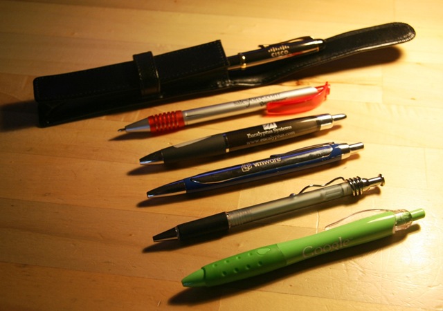
The only pen to come in a pouch. A very professional pen meant for serious people. An enterprise pen.
This is a heavy pen (but not the heaviest) which is going to be solid and reliable. It’s also the only pen with a lid meaning that is sits very nicely in the hand and is quite well balanced.
As for colour – it’s nearly black, so it’s conservative even in it’s colouring.
Writing Stars: ⭐ ⭐ ⭐ ⭐ ⭐
In complete contrast to the Cisco pen, the Salesforce.com pen is an incredibly cheap pen.
The pen I was given is actually broken. The reason it is the only pen pictured with the nib showing is that it won’t go back in and it has a crack down one side.
This pen did come in a kind of a sleeve, but it was really just a plastic wrapper. The side of the pen shows the logo, which is, of course, the name and the web site address.
Colouring – it’s silver and red which I take to be bold but not really funky or cool. It’s corporate, but not really corporate.
Writing Stars: ⭐
This is the only pen in the set to have a logo, a company name and a web site address. Perhaps this says more about Eucalyptus as a young organisation than anything else.
It’s a nicely weighted pen, on the light side, but with a good grip.
The pen itself is a Smokey black, but it writes blue. It might just be me, but there is something wrong about a pen that is coloured black, but writes blue.
It writes well and starts from the off, not requiring any warming up.
Writing Stars: ⭐ ⭐ ⭐
This is easily the heaviest pen in the set. I wouldn’t want to write with it for long, my fingers would drop off. It’s a proper metal pen and you definitely know if you drop it on the desk, actually the whole office knows if you drop it on the desk.
This time it’s a blue colour pen – that writes black (What are you guys trying to do to me?) Having said that, the blue does appear to be the standard VMware blue that they use in all of their material so works as a branding tool.
It writes well enough, but for such a heavy pen there is no grip to step it sliding around your fingers.
This pen also rattles a bit, I really dislike pens that rattle as I write.
Writing Stars: ⭐ ⭐
Not sure quite what to say about this pen. There’s no logo on it, or any writing. It came with a notebook with the company name on it. I’m not sure whether putting the name, or logo, or web site address on the pen was too expensive for this relatively new organisation, but it’s certainly an opportunity missed.
I have hundreds of this type of pen and quite like them. The only think I don’t like about them is that I have a habit of twisting the clips off the top of them and it’s almost impossible to twist it back on.
It’s silvery see-through with a black grip. Not much to say really.
Writing Stars: ⭐ ⭐ ⭐
I did have a couple of the Google pens in different colours. One of the things about having children is that pens quickly get appropriated to other purposes. On the colour front, as you’d expect, the pens were all in the colours from the Google logo.
No need to put a web site address on this pen.
It’s a perfectly adequate, functional, plastic, writing implement. The grip is good and it’s a good size for my hands.
A green pen that writes blue, but somehow I can cope with that more than a black pen that writes blue or vice versa.
The kids regarded this as the cool new pen to take into school.
Writing Stars: ⭐ ⭐ ⭐
We did go and see Microsoft, but they didn’t give us a pen – they gave us a drinks bottle.
