For those of you who are reading this through a some kind of Reader you might be interested to know that I’ve been tweaking the design on this site.  For the rest of you, you’ve probably already noticed.
There was a bit of thought behind it:
- 3 Columns – I like 3 column designs, most people have a wide enough screen these days to make the most of it.
- Simplicity – I like designs that are very simple, but still functional. I’m not a huge fan of designs with loads of bling. I know that this slightly contradicts the previous point but it’s a balancing act.
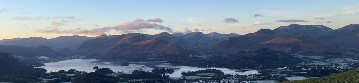
- Photographs – I wanted something that would showcase some of my favourite photographs. Pictures are also a great way of engaging with people, but the skill is creating a design that allows this without it being gaudy.
- Fonts – I don’t like serif fonts. Don’t know why particularly, I just don’t.
I’ve still got some tweaking to do.
Let me know what you think.
